Perfect "Thank You" Page for Your eCommerce Website
Your landing page was carefully planned and launched. The sales copy was highly effective,  and that reader converted to a paying customer. That’s great! But, what did you do after that? Did you get more use of that conversion, or did you simply go back to waiting for another conversion?
Yeah, that’s a problem.
Generally, when a visitor completes some sort of action on your landing page, such as signing up for your newsletter, they get bumped over to a “thank you” page. Most websites, however, have “thank you” pages that are certainly nothing to write home about. They don’t attract and keep the attention of the visitor, and they definitely do not compel them to take any further action. They fall flat and you miss out on additional sales opportunities. It’s not just sales, though. You’ll also miss out on future engagement, the chance to guide them to other parts of your site, the chance to get them to follow your brand on social media, and other chances. But, with a great “thank you” page, you’ll keep those visitors coming back for more content, more sales, and for more of what your brand has to offer.
In this article, you’ll find out how to create the perfect “thank you” page to optimize your visitor engagement and conversions. So, let’s get started:
What is a “Thank You” Landing Page?
In order to create the perfect “thank you” page for your eCommerce website, you first need to understand what it is. When you get down to the basics, a “thank you” page is a page created as an immediate redirect for website visitors who complete a main action your website. Now, this action could be any action you set as a goal. This could be joining your mailing list, downloading your whitepaper, purchasing a product, signing up for a service, signing up for a webinar, trying a free trial, etc. Whatever that desired action may be, your visitor is redirected (or should be!) to your “thank you” page once they have completed that action. While it may seem like its only function is to confirm an action was carried out (“Your order has been placed”), it actually does far more than that.
Why You Need a “Thank You” Page
How many times have you filled out a form, only to be redirected to an unorganized, cluttered, completely lackluster page? Or maybe one that was just all white and said, “Thank you.” If you’ve used the internet to get any shopping done, or even just in general, you’ve likely come across this a couple thousand times. And it doesn’t really impress you.
It’s important to make a customer feel validated and reassured about their decisions, from signing up for a newsletter to purchasing a product or paying for a service. If your page is boring or unprofessional, it’s going to be hard to do that. You want a “thank you” page that helps you connect with your customers and establish consumer-brand trust, which is what keeps that customer coming back again and again. It’s what gives you that positive review. It’s what keeps your sales funnel healthy and thriving.
“Thank you” pages create sales opportunities. They establish relationships with your customers, and they keep your customers actively engaged with your brand. So, not only do you need a “thank you” page in place, you need a good one. And that starts with the initial conversion. So, let’s break down the elements of what makes a good landing page.
Elements of an Effective Landing Page
Unique Value Proposition
On average, you have about 7 seconds to grab your visitor’s attention before they go somewhere else. This is where a strong UVP, or unique value proposition, comes into play. This should be a clear, concise, and compelling message that gives your visitor a reason to choose your brand and not go to one of your competitors. In order to grab – and keep – their attention in 7 seconds, you should have:
-
An explanation of how your visitor will benefit from your brand and what you have to offer. Focus on THEM, rather than talking about yourself.
-
A strong UVP that tells your visitor your website is better than the other websites they’ve been browsing.
Getting these points across is the ultimate goal of your UVP – make it count!
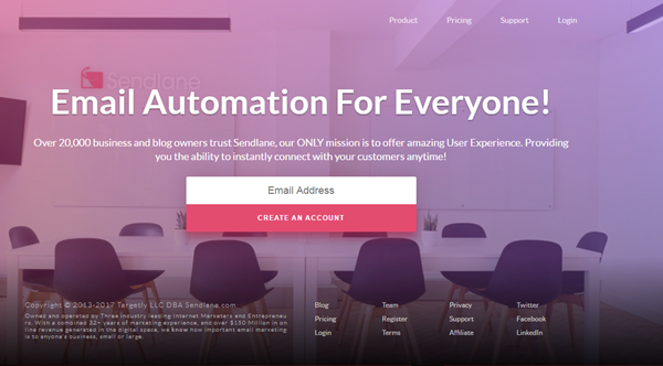
[Landing page of Sendlane.com – email marketing automation]
With Sendlane, your benefit is: Email marketing automation made simple. Anyone who owns or markets a business will understand how complicated and time consuming it can be to optimize your marketing collateral and make sure the right type of emails reach the right people at the right time. Sendlane.com shows how many business professionals trust their products to help them connect with their customers. Or check out this page from Snaptactix. There is the UVP, with lots of value being demonstrated here.
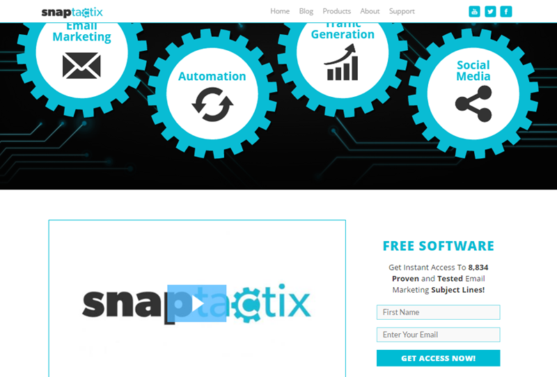
The UVP on this page has big, fat letters to draw your eye. It tells you what you get and uses the words “proven” and “tested” to show others have utilized and trusted their products. All in just one, powerful sentence. It takes a lot of work to craft a strong UVP, but it’s definitely worth it. Take some time to write up UVPs of your own, and then do A/B split tests to see which version resonates best with your visitors.
Call-to-Action
No landing page is complete without a call-to-action (CTA). Think about it: The whole point of a landing page is to compel your visitor to carry out some sort of action (e.g. sign up for a newsletter, download an eBook, request a demo, sign up for a free trial, purchase a product…). Whatever action that is, the CTA needs to persuade them to carry through with that action. Generally, a CTA is a button, bold sentence, or a link. It’s obvious. It’s not surprising. It’s not sneaky. It just calls them to action.
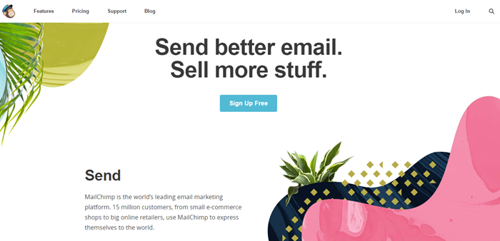
[MailChimp features a contrasting, blue CTA button. They also tell you (simply) what you’re signing up for, what value it brings, and how many others trust that business.]
-
To create a strong, compelling CTA, you want to make sure:
-
You only have one objective per page – It gets cluttered and confusing if there are more!
-
To include a button or clickable image.
-
It grab your visitor’s attention by standing out and using compelling verbs (Sign up, start, download, click here…)
-
To demonstrate value, and make it very clear what your visitors get when they click the CTA button.
Incentive
You need to give your visitors a reason to click on your CTA button. Sure, you told them how many customers you’ve helped. Sure, you’ve told them how many others have signed up. You’ve even told them exactly how you can help them. But, sometimes, you need to give away money in order to make money. In this case, you want to give away something of value in order to get them to take action.
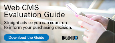
[Ingeniux offers an evaluation guide in exchange for clicking through.]
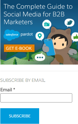
[Pardot offers a free social media guide if you click through and fill out their form.]
Landing pages are built with the sole purpose of converting website visitors into sales leads. Generally, this is done by getting them to sign up for a newsletter. More often than not, brands are offering something of value in exchange for an email address or other contact information. This makes the CTA be to register for an email course, download a book, or get a free guide. Providing free, value-driven content is a pretty common practice in marketing an eCommerce website – one that strengthens your strategy. By getting your visitors to sign up to receive high-quality content from you on a regular basis, you build and nurture a consumer-brand relationship that will eventually result in a sale. Or multiple sales.
Once they download the free content, and reach the “thank you” landing page – which we’re about to get into – they turn from a cold lead into an active lead. Which means they’re on their way to becoming a customer. But, you need a strong “Thank You” page to get to that point.
Building a Strong “Thank You” Page
As we talked about earlier, the “thank you” landing page gives you an opportunity to guide that visitor further down the sales funnel. It should have all of the elements of a regular landing page, with some added aspects.
The “Thank You” Message
Your “thank you” landing page should have the obvious “thank you” message. How you phrase it is up to you, but this is the essential part of the page. The “thank you” is what confirms for both you and your visitor that the desired action was performed. After that, you want to give them directions for what to do next.
Clear Instructions
Your visitor just signed up to get your eBook. They signed up, and now they’ve reached your “thank you” landing page. It should let them know the eBook is on its way to their email inbox, and that they can expect to receive it shortly. And it should include a strong CTA that guides the visitor to the next step in your sales funnel. This could be:
-
To check out additional resources (link to your blog or guides)
-
To check out your products
-
To head on back to your homepage
-
To share a particular post on their social media
-
To follow you on social media
Redirect
Rather that optimizing an entire “thank you” landing page, it may work better for your brand if your visitors are automatically sent to another page after a few seconds of being on the “thank you” page. This way, they are immediately sent to additional content or products, which may supplement the offer that got your visitor to sign up. For example, you could redirect them to a blog post about social media marketing after they downloaded a guide to increasing their Twitter following.
Final Thoughts
These are the key elements of an effective “thank you” landing page, along with some examples of great pages that compel its visitors to take action. The perfect “thank you” landing page offers your visitors the promise of more. It gets them to connect and engage with your brand. It demonstrates brand value. It drives traffic to other areas of your website, nurtures your leads, and keeps your sales funnel flowing. Use these tips to move past the lackluster, boring pages you have seen during your own internet searches. Create a “thank you” landing page with strong copy and incentives that your visitors can’t resist.
What is your most effective landing page strategy? Share it with us in the comments below, and don’t forget to share!

Alexia Bullard
Alexia P. Bullard is an overly caffeinated freelance B2B/tech writer. With a wealth of experience in digital and traditional marketing, she has worked with many businesses to help increase their website traffic and boost their sales.